PLATFORM
Responsive Web
Mobile iOS
TV
ROLE
UX Flows
Interaction Design
Interface Design
NOW TV is a video on demand service competing with Netflix and Amazon Prime and a Sky TV product in the UK. It is a contract free service, meaning a customer could buy a daily, weekly or monthly viewing pass with no strings attached.
In the last two years, the viewing product platforms have gone through a massive UX and UI upgrade across all supported devices, including releases of NOW TV products like the Smart Box and Smart Stick.

GOAL
Creating a seamless and consistent interaction + visual experience across all NOW TV platforms.
PURPOSE
The old experience had a few key issues, causing a steady decline of users continuing their subscription to the service.

Before and after the redesign
RESEARCH INSIGHTS
Using a variety of research methods likes diary studies, in-home interviews, and regular A/B testing using tools like Apptimize, an overview of key recurring themes and pain points were highlighted. This helped synthesise a series of insights that guided mapping & creation of user journeys across each platform.
Some key highlights:
1 .The old layout did not surface relevant content and made finding content hard for most users
2 .Colour contrast between text, content imagery and the background was not user-friendly across the wide spectrum of users
3 . Users were unable to find their customised content – which caused a lot of frustration in users,
especially when they switched between platforms depending on their viewing patterns
4 . Users dropped off the service as soon as their favourite show/sport ended, as finding new and relevant content was challenging and not upfront


LAYOUT EXPLORATION
With the support of the insights gathered, the first action was to look at the layout of content and consistency between the platforms.
With the preset guidelines on how metadata and artwork should be applied, a set of responsive and scalable templated were designed. After several iterations the visual prominence of the top featured tiles, followed by customised rails of user-specific content and the remainder with editorially curated content worked best.
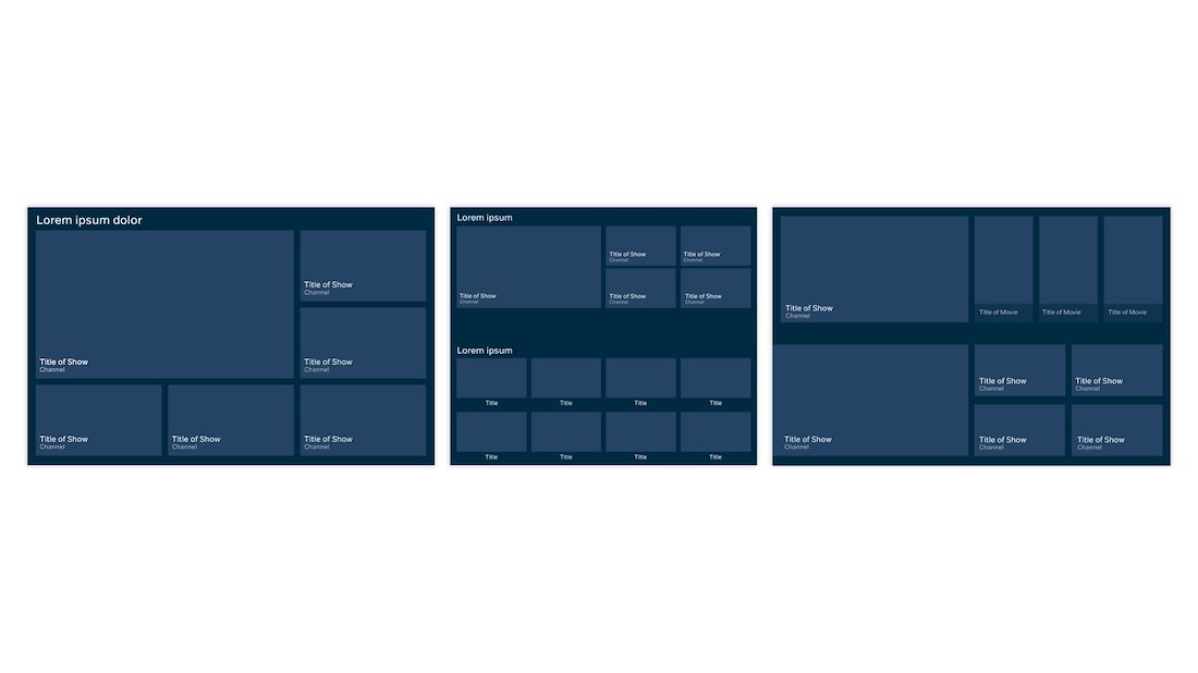
INTERACTION MODELS
Editorially curated content was often not easy to discover for users in the old experience. This was tackled by using rails for curated content which enabled more content to be showcased within the same screen space without disorienting users.
One of the patterns that was applied was that rails would be used to help users explore and discover content better, which meant that to contrast this experience, once a user went a level deeper by clicking on a tile, the experience would move to a grid format that showcased the details on the content all in one vertical experience.
The iteration below tested the best amongst the widest variety of user types.
Old design (left), the new layout (middle) and design applied (right)
Web required a slightly different approach to the same rail interaction
VISUAL EXPLORATION
The black background previously used in the old experience unfortunately failed in contrast differentiation with a lot of the production house provided artwork.
Using the RNIB accessibility guidelines, a variety of colours that still worked with the brand colours of the service were tested across different platforms, screens, sizes and operating systems. The selected dark blue tested best with contrast checking applications and was received better across the users this was tested with.
One of the key guidelines to keeping the design scalable meant creating templates that could easily scale between platforms, without requiring massive code formatting and not requiring any additional artwork creation on a regular basis.

Some of the other design variations explored
VALIDATION OF DESIGN SCALABILITY
One of the key factors that helped validate the design/development strategy was the introduction of Hayu content in the platform. This meant that not only did the content have to work in the visual design system following the intricate balance between the NOW TV experience and the 3rd party content branding, but also work with the backend platform to generate visual content with the least amount of human intervention.

NOW TV Entertainment content and Hayu content on the platform
KEY LEARNINGS
WIDER VIEW
It's easy to get holed into a specific feature or device journey. Stepping out and taking an overall view more frequently would have improved the process even more.
SELF MANAGEMENT
Making every user happy is hard. Learning to not react but analyse to respond in the design is a skill that I'm glad this project helped me realise and act on.
ADAPTABILITY
Learning to adapt with various device/discipline specific teams and creating communication opportunities was key. This enabled my communication skills and methods exponentially.