PLATFORM
Mobile iOS/Android
ROLE
UX Flows
Interaction Design
Interface Design
Visual Design
Babylon Health is an affordable, on demand digital healthcare service that provides a variety of healthcare features for a wide range of consumers and clients across the UK, US, and Rwanda.
A cross-functional team of content designer, technical engineers, analysts, healthcare professionals, researchers and product designers worked together on the product and service offering showcased below.

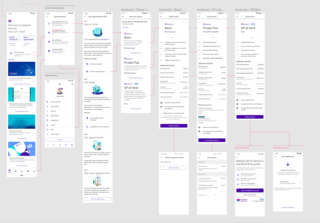
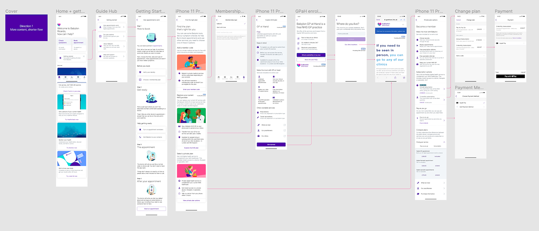
Babylon Health – Homescreen – Get started guide
GOAL
To help new Babylon users learn. compare and activate the appropriate membership plan. Our key objectives were to increase sign up to activation amongst users within 30 days of sign up and improve their first action with effective onboarding (action: either activating a membership, booking a GP appointment or interacting with our health monitor or AI tools).
PURPOSE
From analytics and user research we were able to identify that a healthy percentage of our new users that did not engage with the app within the first 30 days were users that would not come back and therefore lost customers.
We identified that the homescreen on which users were dropped onto after sign up was relatively empty and had very little to bring the user into the product and it's value offerings. This meant this was an opportunity to improve the new user experience with effective onboarding guides, articles and guide the user through that initial experience with a sense of human empathy.
RESEARCH INSIGHTS
In our research we were able to conduct in-person interviews and a series of online tests for a variety of new users and understand the nuances of a new user journey within our app.
Some key highlights:
1 .Users were usually quite lost on how to navigate from their first visit. Not having an effective guide or onboarding experience meant that we lost on engagement within the first few minutes of a journey.
2 .Decision making was hard to comprehend for most users in terms of selecting a membership. With no easy way of comparing the available features in each option, most of the users were guided by price and not convinced to activate a membership at the end.
3 . In this model of healthcare the content and context that is needed to be covered in the app is quite heavy. This meant that the retention of information towards the end of a journey, amongst our test participants were comparatively low.
4 . For some users, digital healthcare was totally out of their version of normal. This meant creating a warmer and easier experience in balance with the seriousness of the content.
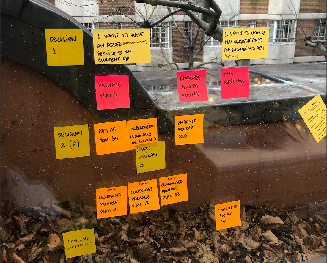
CONCEPTUALISATION
The design brief included looking at how we introduce aspects of the app as an overview and help users make the most appropriate decision on a membership option for themselves.
Macro plan: Our initial plan was to introduce a 'Get started' guide which could be interacted with or dismissed when the user landed on the home screen after sign up. A lot of this information is still accessible in different parts of the app, but this was an opportunity to lift these into context to help guide the user.
This included an introduction on how a user could book an appointment and attend one within the app, a brief introduction to the latest feature tool and an overview of Babylon and its offerings.
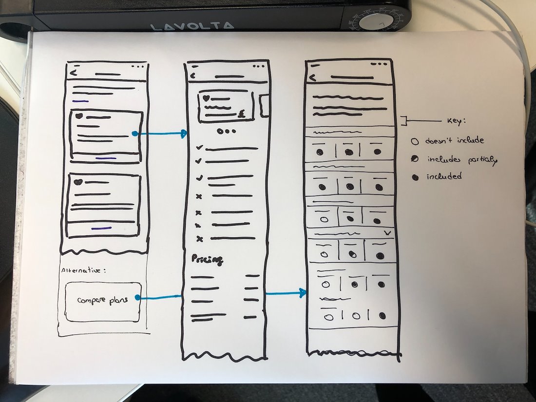
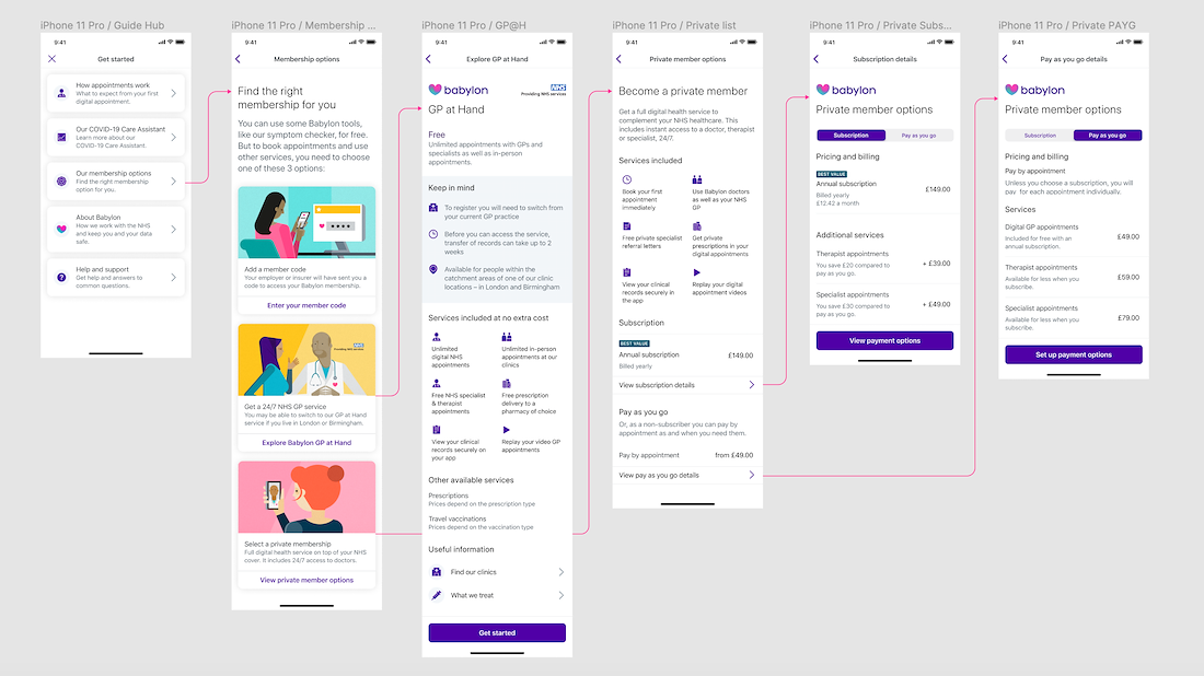
Babylon Health – Membership guide (Left: iteration 1; Right: final design)
USER TESTING
As part of our design process, we tested our design iterations every 2 weeks with a variety of users via online user testing platforms and in-person interviews. Highlights from our research showcased how impactful visual language and tone of voice were especially when it comes to serious life choices and financial interactions.
The design was shaped with the feedback we received with rapid iteration and delivery within research tests and loops to maximise our learnings.
Below (left) is where we started and the final design ready for production (right).

STRATEGY
Strategically we needed to understand how to break down the content into easy, comprehensive steps to guide the user without overwhelming the decision-making process. This meant constantly reviewing the content design at every interaction level revealing a minimalist yet utilitarian approach to information comprehension.

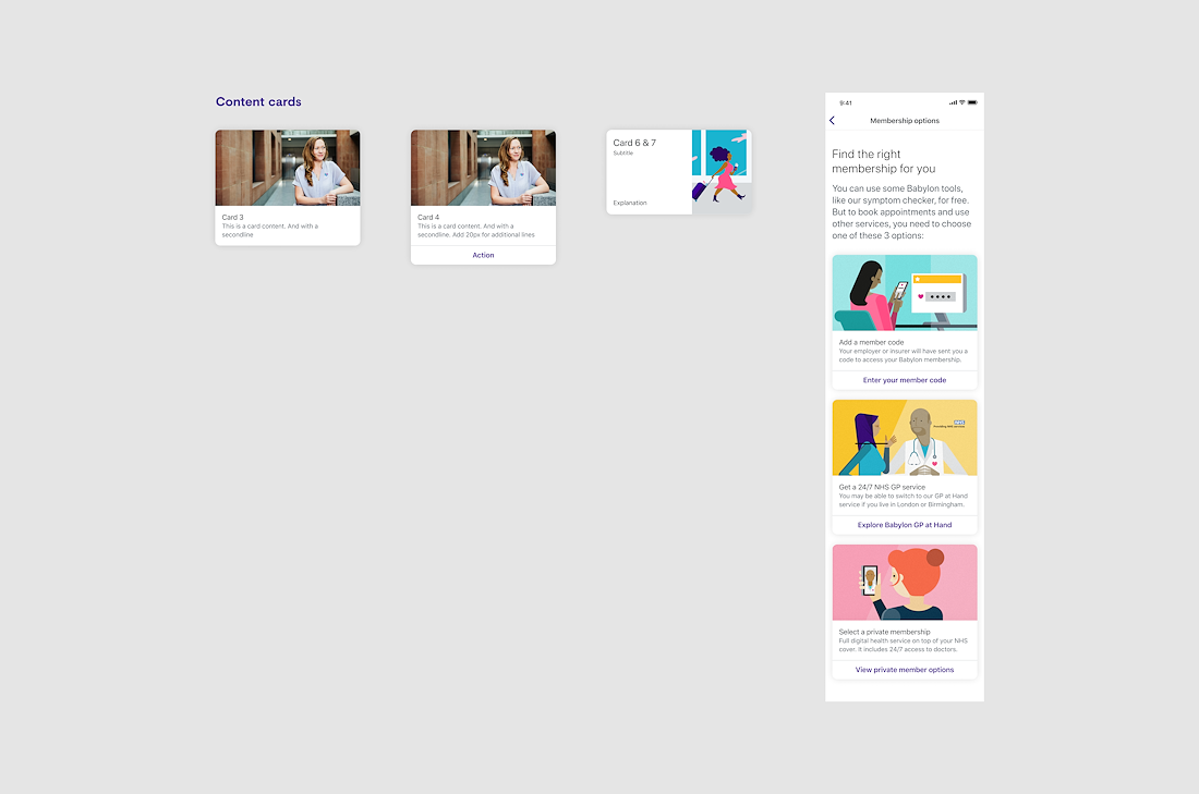
Membership options – Evolution of content & design
VISUAL DESIGN
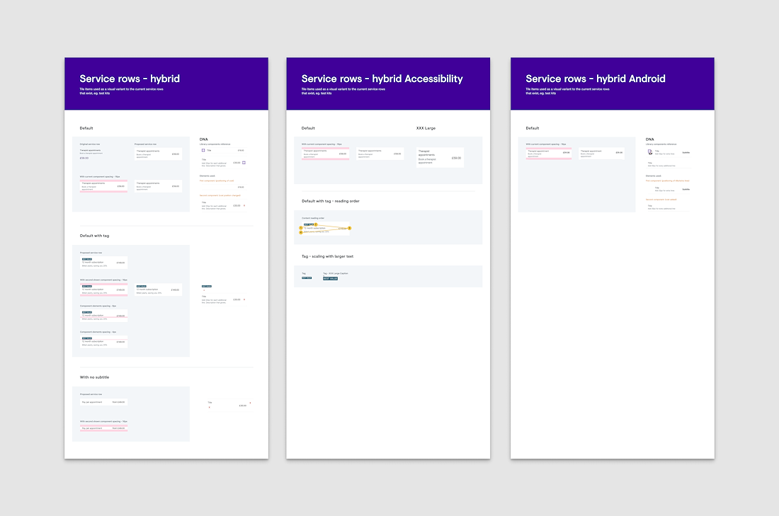
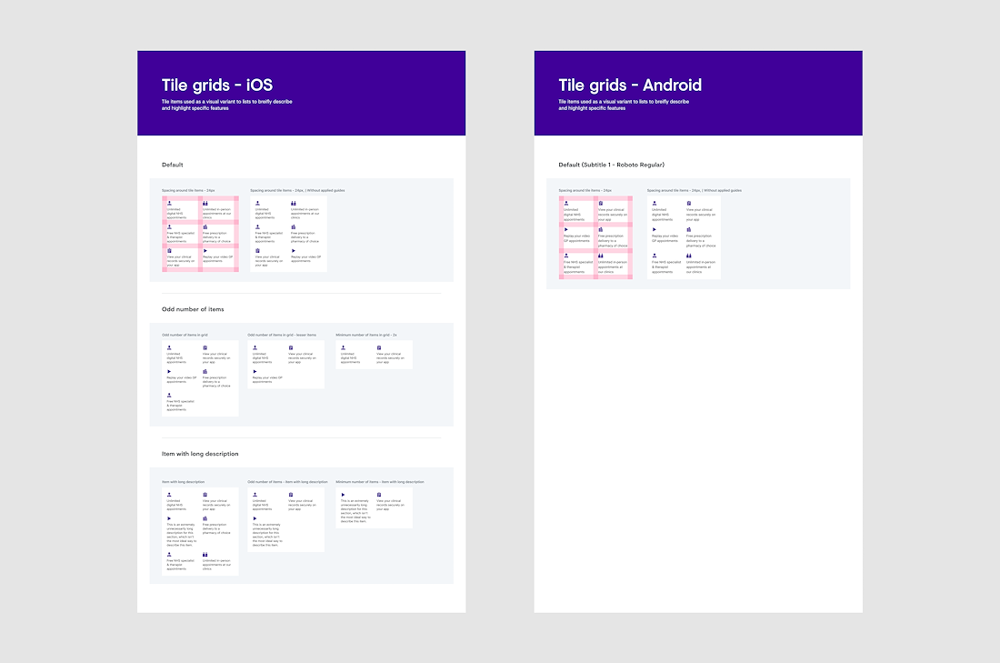
Babylon has a very mature design system with strong elements that have been used as components across the iOS and Android app. A few components needed customisation for the specific content included in this workflow.
This required proposing new components for the design system and working with the relevant teams in reviewing and building out the new components. This included designing for accessibility across the platforms.
KEY LEARNINGS
ACCESSIBILITY NOT AS A FEATURE BUT A PRIMARY DESIGN PRINCIPLE
This was a truly eye-opening experience, as in most design teams we would look at accessibility as an added after-thought. Here, accessibility was one of the main design principles to follow, which meant when we were exploring designs, we had to explore them with accessibility as a primary review sign off. This radically changed the way I look at design for inclusivity.
TEST + ITERATE FAST
Using the existing design system, we were able to explore a wider number of design directions, this also gave us the opportunity to be more effective in getting test prototypes out in front of our users. Learning from the insights from each quick round meant delivering more robust and validated designs without getting lost in the process itself.